Debt, People & Politics
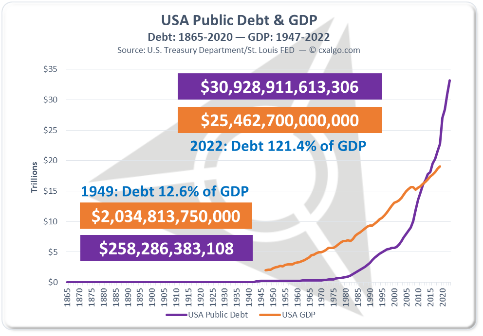
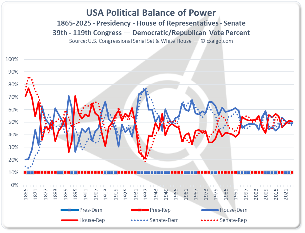
The old adage about pictures as a replacement for words still holds true, and is a wonderfully direct method of illustrating a given point. Now the burning question is "what exactly triggered the hyperbolic, out of control public debt growth in the USA?" Well, to the disappointment of many, let it be known that defense spending and wars were not the debt culprits, and the weapon/soldier scapegoat has been beaten so many times, it no longer hops out of the trenches.
Truly efficient government shouldn't have any debt, but that's wishful thinking at its best. Starting with public debt of $64 per person in 1870 as the basis, a mere 34% of the average annual wage for a farm hand back then, it's rather astonishing that today's public debt amounts to $68,300 per person, almost 54 times greater than it should be, or $1,276 after taking inflation into consideration. In addition, $68,300 is about 275% of the current annual wage for a farm worker. Why?
It's all about demographics, productivity and welfare driven by 50 years of policies coupled with historical and global socio-techno-economic achievement as a measuring stick. Connect the obvious dots.


